I finished the last post promising an update on the cover art for my upcoming novel, Dead Letters. A lot has happened since then but it’s true to say that I haven’t delivered on my promise. I’m here to put that right. Kind of.
In short, I’m struggling with how to market Dead Letters, but I have a few irons in the fire, which I hope will lead to something in the coming weeks. I hope then to be able to come back with something more solid to share.
But in the meantime, how’s Troubleshot doing?
Well, it’s sold beyond my expectations, honestly, but it’s still pretty small fry for an indie book. And that’s fine. It’s quite niche and I always went ahead with it as an experiment, to learn about this self-publishing business. And it sure has been a learning experience, as you’ll read from my other posts! One of the things that’s been bugging me, though, is the cover. I write about my choices in this post, but each time I come back to it, I question them.
So here we come to ***The Great Pauly M Cover-Choice Vote***
I encourage audience participation here, through comments in Facebook or at the bottom of this post. “What’s in it for me?” I hear you ask. The answer: fame from having your name mentioned in Troubleshot’s acknowledgements (unless you tell me you don’t want to be associated with such nonsense, in which case I will take great offence but probably honour your wishes).
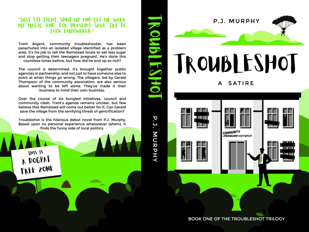
In the red corner:

The current cover. I wanted something bold and basic. I like it. But as I look at it more, it seems a bit… amateur.
In the blue corner:

A redesigned cover by a different artist. I gave her the brief that I wanted the same general structure but just a bit more polished. I’ve already used images from it on my Amazon page but I’m torn about whether to actually replace the cover. I’m worried that it still looks like something someone whipped up on Photoshop and suffers a bit from being in the no-man’s land between basic and fully professionally polished. But I’d appreciate your views.
In the yellow corner:
A similar design but by an artist I’m looking to use for Dead Letters, whose work is very smooth, professional-looking and individually drawn. So the same, but closer to mainstream publishing quality.
In the turquoise corner (not sure why I chose turquoise, apart from to use my spellchecker):
Something else entirely! If you’ve read the book, maybe there are other ideas you’d propose (and while you’re at it, why not leave a rating on Amazon (hint, hint)???
I’m looking forward to hearing your votes of red, blue, yellow or turquoise – or whatever other descriptor you’d like to use. The colour choice is confusing me already…
Until next time!

Leave a comment